4 Exploratory Data Analysis
Before you can dive into the data, set up your programming environment. This will be the place where the magic happens – all your coding will take place there.
In your workspace on RStudio Cloud, we have already uploaded an “assignment” for you (Template Airbnb). When you create a new project within the workspace Class of ’21/22 | TechAcademy | Data Science with R, your workspace will open up.
We’ve already made some arrangements for you: The data sets you will be working with throughout the project are already available in your working directory.
We also created an RMarkdown file (a file that ends with .Rmd extension), with which you will be able to create a detailed report of your project.
You can convert that file into an HTML document when you have finished coding the project in R.
Open the file Markdown_Airbnb.Rmd and see for yourself!
We recommend using Google Colab for this project since it requires no particular setup, stores its notebooks to your Google Drive, and makes it easy for you to share them with your team members.
As an alternative to Google Colab, you might want to install Jupyter Notebook locally using the Anaconda distribution. Either way, when importing Airbnb data, you can use the links to the respective data files provided in the “Data-Links” document, which you will find in the TechAcademy drive.
We will give you a more detailed step-by-step demo during the first coding meetup.
4.1 Visualizing Apartment Availability
Imagine being a tourist on a budget. First things first, you might want to check for periods when apartments (or, Airbnbs) are available for booking on the market. Remember the basics of economics? A lower supply of a product on the market usually comes with higher prices (all else equal). Vice versa, a higher supply of a product might come with a lower price. That is precisely what you want if you are on a budget! Explore the data set looking for periods with high availability and find out later whether that basic economic idea holds in the Airbnb context.
4.1.1 Import, Clean and Transform the Data
In this chapter, you will apply the knowledge that you gained throughout the semester to real-world data. The exercises will cover typical problems that you usually encounter when analyzing data.
First things first, you will need to load the calendar.csv file into your coding environment: How is the data structured, and which variables does it contain?
To get a peek at the data you’ll be working with, output the first/last few rows.
Also, compute some basic descriptive statistics (e.g., count, mean, and standard deviation) and determine the column’s data types.
First, load the necessary packages/libraries that you intended to use for your analysis.
Then, load the data set from your folder structure into the workspace. Import the calendar data set into your workspace and name the object accordingly. Use, for example:
calendar <- read_csv("calendar.csv")
Now get an overview of the data set. How is it structured, and which variables does it contain? You can use the following functions, for example:
head(calendar)
str(calendar)
summary(calendar)
Import the pandas library to your notebook with import pandas as pd.
Use the same pandas method used to import CSV data on Datacamp to import CSV files from a web server: Just replace the file path with the URL of the CSV file. Find the links to all datasets here. Be aware that our csv data has been compressed to gzip format (.csv.gzip). This is no problem! You can still use the same method, but you will need to add an additional argument to the function, which is compression="gzip".
…yes, the pandas library is extremely powerful! 😉
Take a look at the first rows of your data frame and print some descriptive statistics with the pandas methods .head() and .describe().
Also, find out the data types for each column: Are values in the price column stored as numbers?
Visualization is one of the most helpful methods to get a feeling for the relation of the various variables of the data set. As already mentioned, this process is called Exploratory Data Analysis (EDA).
Before starting with that, we first have to clean the data so that the functions can process the data set correctly. You will have to do that quite often in the field of Data Science since the data very often comes in an unusable format. For example, in our case, the values in the price column are not stored as a numeric data type – this becomes an issue when performing math operations on such columns.
In order for R to process this, we need to remove a character from the observations and convert the variable into a numeric format.
You can use the functions str_remove_all() or gsub() together with as.numeric() for this.
To make the next step easier, we still have to convert the logical variable available from a character to a boolean data type.
Use, for example, the ifelse() function for this and replace “f” and “t” with the associated logical values FALSE and TRUE.
As a last step, transform the date variable into the R format Date.
Remember the as.numeric() function?
R has a similar function to convert variables to a date format.
To remove a character in a column’s cells use pandas’ .replace() method.
Similarly, convert the data to a different type with .astype() (Hint: You might need to apply the replace method twice on the price column before converting).
Note that the column indicating apartment availability contains two values, namely f and t.
Replace f and t with the associated boolean values FALSE and TRUE.
Our goal now is to show the number of Airbnb apartments available over the next year in a simple line plot. However, this goal is still not possible since there is an entry for each apartment in the upcoming 365 days. And another related variable that shows us whether the apartment is available or not on each of those days is present too. The transformed data set should summarize this information and have only one entry for each day that tells us the aggregated number of available Airbnbs in the city.
The R package dplyr is the first choice for this type of transformation task.
If you haven’t heard of it yet, take the respective DataCamp course or the DataCamp course on Exploratory Data Analysis.
Use the dplyr functions group_by() and summarize() and save the resulting data set in a new data frame, which you can call avail_by_date.
You can, of course, name the data frame however you wish.
If you need further help, you can also use the dplyr Cheat Sheet for this task, on which you can visually see such transformations.
To understand this step, remember that you converted the values in the available column to be of type bool.
In Python, the boolean value True is equal to 1, while False is equal to 0.
Thus, True + True + False is equal to 2 (you can try this out by executing print(True + True + False)).
So, to get the number of available apartments, you could simply sum the (boolean) values in the available column!
But before doing so, make sure to group the data frame by date with .groupby() in combination with the aggregation method .sum() as you need to get the number of available apartments for each date.
The pandas Cheat Sheet might be of help here - feel free to make use of it.
4.1.2 365 Days Lineplot
We have finally transformed the data set into a useful format, so now it is time to actually visualize it. We are going to get started with a simple line plot that shows the number of available apartments over the next 365 days. This is what your result could look like:
For this visualization, you can use the base package that includes the function plot() or use the more extensive and very flexible graphics package ggplot2.
We highly recommend getting comfortable with using theggplot2 package as it’s one of the most used R packages overall.
Having the data in the correct format, we can now start plotting a simple line graph.
For this, you can use matplotlib’s plt.plot().
Looking at the line plot above, you can see a clear pattern for different dates. There are distinct drops in the availability of Airbnb apartments. One task for your project is to think about a potential cause behind this pattern: Is there one?
4.1.3 Calendar Plot
A line plot is good but let’s be honest; it’s nothing to write home about! How about using a calendar plot to get a quick overview of this year’s most and least abundant Airbnb months? Let’s see how this looks in both R…
… and Python:
There are country-specific holidays and seasons, after all!
Check out the calendR R package to visualize the availability of Airbnb listings in a calendar plot.
You can use the package calmap to visualize availability in an intuitive manner!
4.2 Correlation Coefficient and Plot
Now that you are confident that there are some distinct patterns in the data set, you might be willing to quantify your suspicion.
For that purpose, calculate the correlation coefficient (r) between availability and price and plot both variables to confirm your intuition.
Regarding visualization, you could, for example, choose between:
a) line plot (boring as you already did it), or
b) scatter plot (exciting as it’s something new for you).
Please write a short sentence explaining what the correlation coefficient measures in this context.
For example, this task could look like:
Answer: “The correlation coefficient shows ….”
Have a look at ggplot2 and plot a scatter plot with geom_point().
Use the stats function cor(x,y), for example, to calculate the correlation coefficient between two variables.
You can use matplotlib’s scatter plot for plotting and pandas’s .corr() method to compute the correlation coefficient between two variables.
4.3 Visualize individual Airbnb Offers with the Listings Data Set
Can we use the mean price of a neighborhood to measure popularity? Perhaps… In the next section, you will compute the average price for each neighborhood, and since, as an (aspiring) Data Scientist, you love numbers and stats, you also want to compute the price variances for these neighborhoods.
Start by importing the listings dataset.
First, you will need to clean the price column.
After that, we can take a closer look at the price structure of the various neighborhoods.
Second, we would like to know the average price and corresponding standard deviation for each neighborhood.
Please list the names of the different parts of the city and their mean and the sd for that purpose.
For this task, you can reuse dplyr-functions like group_by() or summarize().
Once again, you can use the .groupby() method to group by neighborhood and apply an aggregation function for calculating the standard deviation.
A very similar function exists for calculating the mean values.
Filter both data frames by the price column.
Next, we now want to visually compare the price distribution for the, on average, most expensive district with the least expensive district. For this task, think about the different types of plots that you have explored in your courses and find the most suited plot type for this type of visualization. Once you have created your custom visualization, you will probably have to filter out some observations with extremely high prices (outliers) to get a more meaningful plot.
Your plot could end up looking like this:
In ggplot2 graphics, you can easily filter in the plot specifications with xlim() or ylim().
You could use this resource to remind yourself of the different visualizations available in R.
One way to find the, on average, most expensive neighborhood is to sort the mean price column in descending order.
For plotting: The Matplotlib documentation is an excellent source of inspiration with many examples, including code that generated them.
Note: If you do not want to remove outliers, the plot could end up looking very strange. In that case, it is best to create two different plots, i.e., one for each neighborhood.
But wait! Until now, we focused much on prices. What about customer preferences? Next, we will use the average number of reviews to indicate the “hotness” 🔥 of an area in your city!
4.4 Analyzing Number of Reviews per Neighborhood
In the previous part, you got to know and visualize the listings data set.
However, a critical piece of information is missing from this data that we could use to measure popularity.
How about using the number of reviews?
We first start by computing the average number of reviews per apartment. Afterward, we will do the same for each neighborhood. Calculating the number of reviews for each apartment could lead to a vital feature for price prediction.
Fortunately, we have another data set for each city, reviews, that recorded the apartment ID and the date for each review.
Our goal now is to count the number of reviews for each apartment and to keep them.
Since we can also find the ID in the listings data set, we can use that variable to merge the two data sets.
First, load your city’s reviews data set into your workspace and take a closer look at it with the familiar functions.
Afterward, count the number of reviews per apartment.
This works with the table() function or with group_by() and summarize().
Note, however, that you still have to convert the result of the table() function into a data.frame format for further processing.
Count the number of reviews per apartament (i.e. per “listing_id”) with the functions you’re already familiar with at this point.
You can use the groupby argument as_index=False to avoid setting the column with listing ids as index, which might make live more easy when we merge data frames in later steps.
To merge reviews with the listings data set, you have to rename the newly generated variables in the new data set.
Name the apartment ID analogous to the listings data set id and the number of reviews n_reviews.
You can do this task with the rename() function from the dplyr package.
Assign the new column names as a list to the .column attribute.
If your data set looks similar to this, you can merge it with listings:
You can use the following function for merging:
listings_reviews <- merge(dataset1, dataset2, by = ...)
Merge with listings_reviews=pd.merge(dataframe1,dataframe2,left_on=....
Now, look at the new data set. Does each ID have exactly one entry with the number of ratings? Reduce the data frame to the columns listing id, neighborhood, and the number of reviews to better understand your data.
4.4.1 Your First Barplot
We now want to take a closer look at a minor part of the data set: What do the most reviewed apartments have in common? Is it the location?
Extract the 200 most reviewed apartments.
One approach is to sort the data set in descending order according to n_reviews first and then extract the first 200 entries into a new data set.
Now you can easily visualize the districts with the 200 most frequently reviewed apartments. A bar plot is ideal for this. Feel free to try other types of visualizations best suited to answer this question.
This is what the visualization could look like:
The key commands that you can use for this within ggplot() are geom_bar() and coord_flip().
You can plot bar plots with both pandas and matplotlib.
If you chose to plot with matplotlib, you could use the plt.barh() method.
Additionally you might want to use methods like .set_yticks(), .set_yticklabels() and .invert_yaxis().
If Python throws you an AttributeError, then try working with the plt.gca() method.
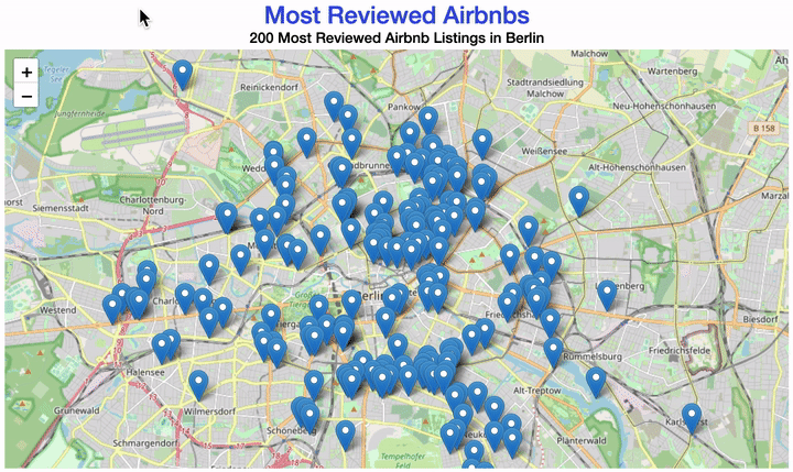
4.5 Visualization with Maps
This part will be the final and most advanced part of the EDA and the most rewarding. Anyone who knows the Airbnb website has probably also seen their map showing the location of all apartments. We can do the same! The only difference is that our data gives us the option to show what interests us 😉
To reduce complexity, use the data set filtered in the task before with the 200 most frequently reviewed apartments.
If you have not solved that previous task yet, select 200 listings according to other criteria or at random to complete this task.
Your map could look like this:
There are different ways of creating a map with R.
Although we plotted our example using the leaflet package, the following tips will be about the ggmap package as it is easier to use.
Before you can download map material via an API interface, you have to define the corners of the map as coordinates.
First, define the height and width of the included coordinates. In the next step, you can specify the exact corners relative to the coordinates in the data set.
height <- max(...) - min(...)
width <- max(...) - min(...)
You can then define a vector, which you can call berlin_borders, as we did for Berlin’s example.
We can use such a vector to determine the values for the edges of the map.
You can add a small safety margin to the respective minimum or maximum of the coordinates.
Play around with the factors later to find a good section of the map.
berlin_borders <- c(bottom = min(listing_top200$latitude) - 0.1 * height,
top = max(listing_top200$latitude) + 0.1 * height,
left = min(listing_top200$longitude) - 0.1 * width,
right = max(listing_top200$longitude) + 0.1 * width)
Then, we can download the defined map section from the service provider Stamen Maps with the get_stamenmap() function and save it in an R-object.
Now you just need to plot it!
We are going to use yet another library, this one is called Folium. For this task you need to work with its documentation which you can find online.
Use folium’s Circle to draw a circle for each apartment at its location coordinates.
You will need to implement a for-loop to iterate over all 200 apartments.
# Initiate the map
m = folium.Map(
    location=[52.5, 13.4],  # Berlin Coordinates
    zoom_start=11,
    tiles='Stamen Toner'  # Map Style
)

# Use a for-loop to plot circles
for idx, row in df.iterrows() :
    # Your code here

m  # Displays the map
In addition to the coordinates, there is a lot of information about each listing in our data. This time, implement a pop-up window to display more details about each Airbnb apartment.
Your map should now look similar to this one:
This time, we created the plot with leaflet.
Why don’t you try to find information on the package online?
You can create a basic map with leaflet and add additional layers by following these simple steps:
m <- leaflet() %>%
  addTiles() %>%
  addMarkers(lng= ,
             lat= ,
             popup= )
Do lng and lat look familiar to you from a previous plot?
The popup is where the magic happens!
Can you make the map show you listings ID, type, price, review score, and number of reviews per apartment?
Once again, you will need to loop through each apartment.
This time however, the body looks more like this:
folium.Marker(
    [longitude, latitude],
    popup="<i>some text here</i>",
    tooltip='click me!'
).add_to(m)
For some analyzes, it is easier if you don’t just see points but their distributions on a map. For example, to see many apartments in a small space, you can display the apartment density. Why not plot a heatmap?
You are now familiar with two packages that can plot maps in R.
If you want to use ggmap to create such a two-dimensional density plot, you can use the geom_density2d() and stat_density2d() packages on the map.
If you don’t know precisely how to fill the individual arguments, you can always Google for more help.
No hints or tips here - it’s up to you to study the documentation for folium’s heatmap and to come up with a (possibly) nice heatmap 😉
4.6 Surprise Us! (With At Least One More Plot)
Be creative!
With the available data, you could do a ton of more stuff. You could try to find the perfect listing that suits your needs and plot an availability calendar for that listing, perfect for your holiday planning! You could further go into a more detailed price analysis or come up with other plots (e.g., distribution of room types per neighborhood, or even number of hosts who join Airbnb per month!). Also, compare the results with your teammates! How do things look like in other cities, compared to yours?
Congratulations – based on your work with fundamental data transformations and many visualizations, you now have a solid understanding of the Airbnb offers in your city! With this step, you have now completed the first part of the project! If you are in the beginner group, you have now met your minimum requirements. Nevertheless, we strongly recommend that you also have a look at the following part. There you’ll be developing methods to predict the price of an apartment! Sounds exciting?